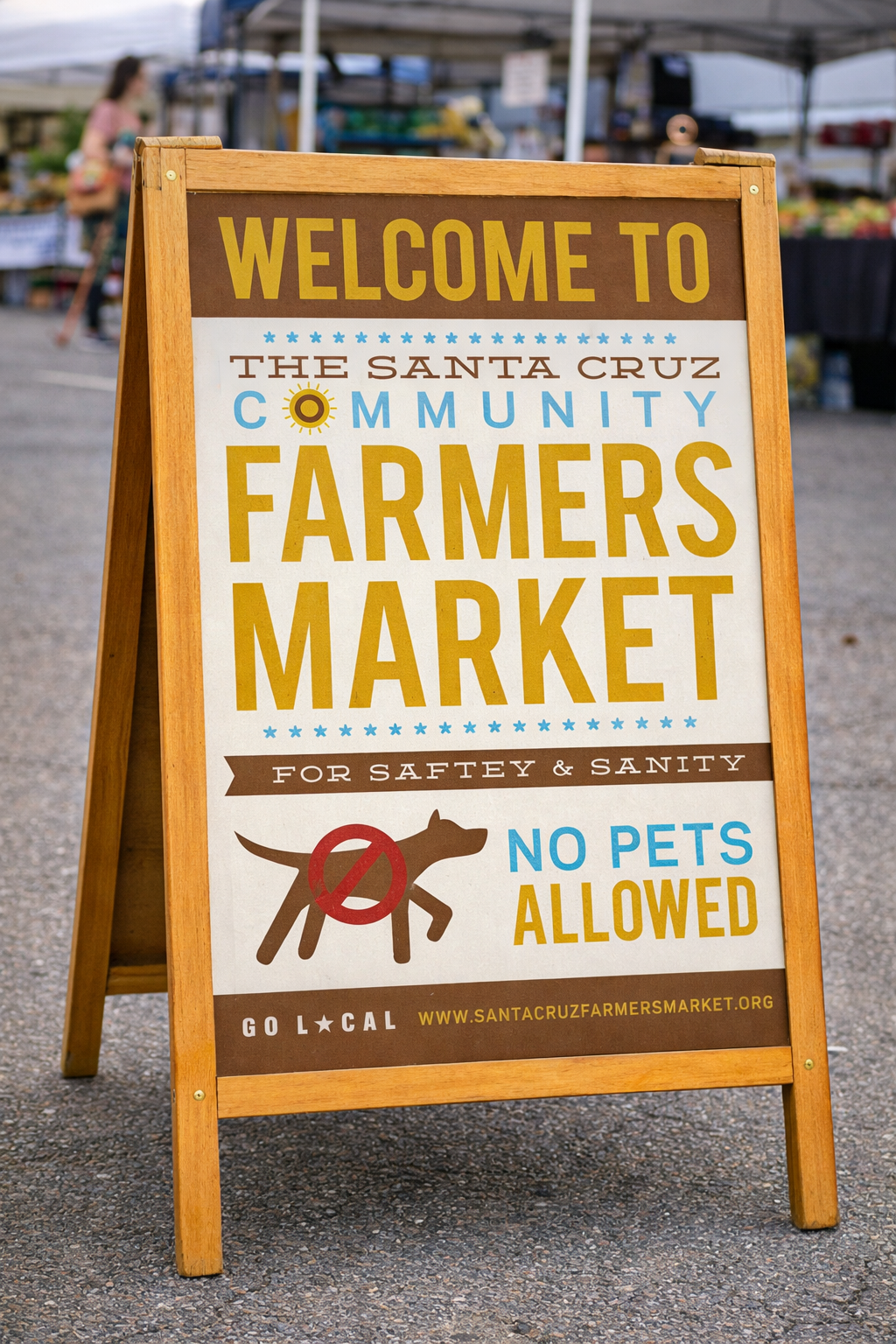

The Approach
When I first started creating work for SCFM, I leaned into variations of type and imagery I felt worked with Santa Cruz Ca, and it's farmer culture. I knew most information would be flyer based, and needed to stand out visually as well as be informative.
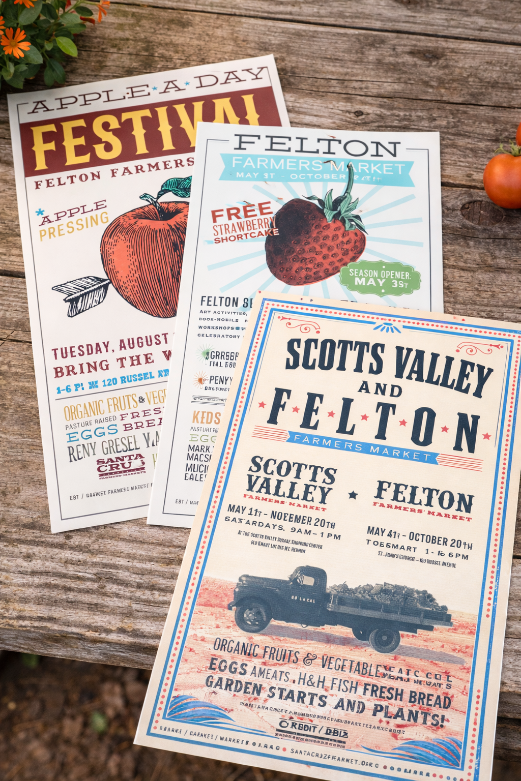

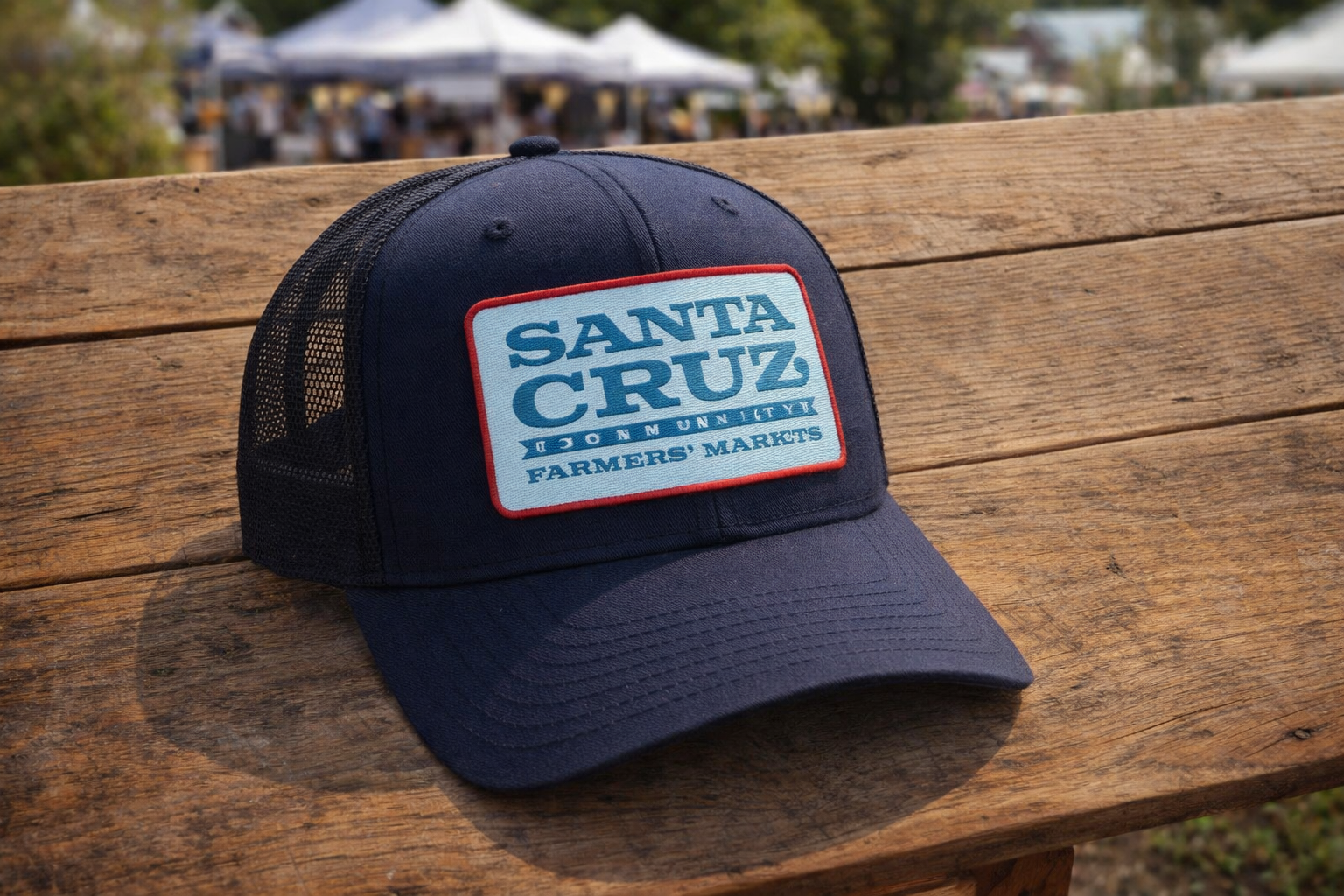
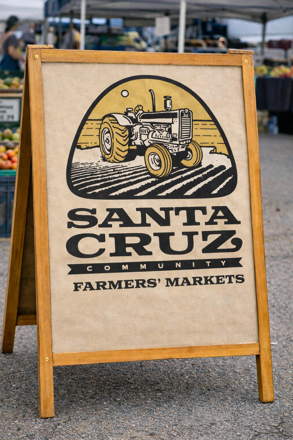
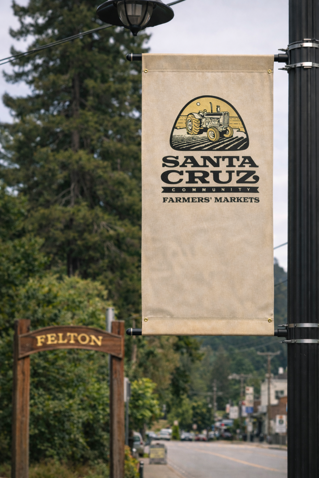
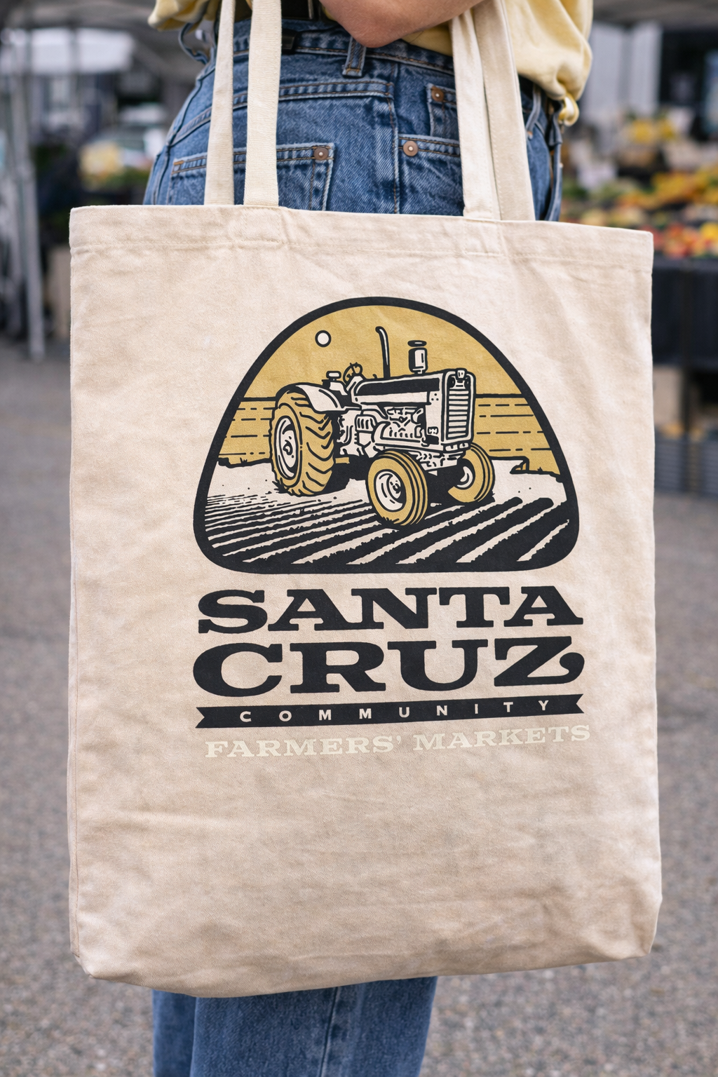
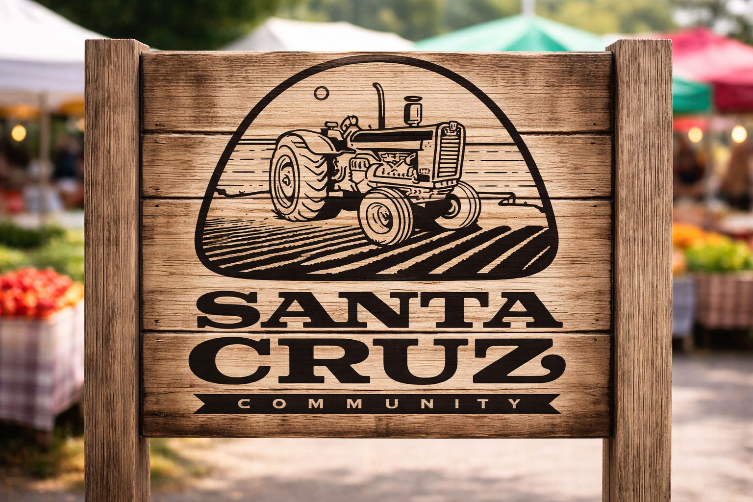
The Santa Cruz Community Farmers Market had an established presence but lacked a cohesive visual system across signage, posters, and merchandise. I first started developing seasonal posters and environmental graphics, and apparel which evolved into a comprehensive brand refinement — I then started establishing a unified identity that now carries consistently across market materials and merchandise.
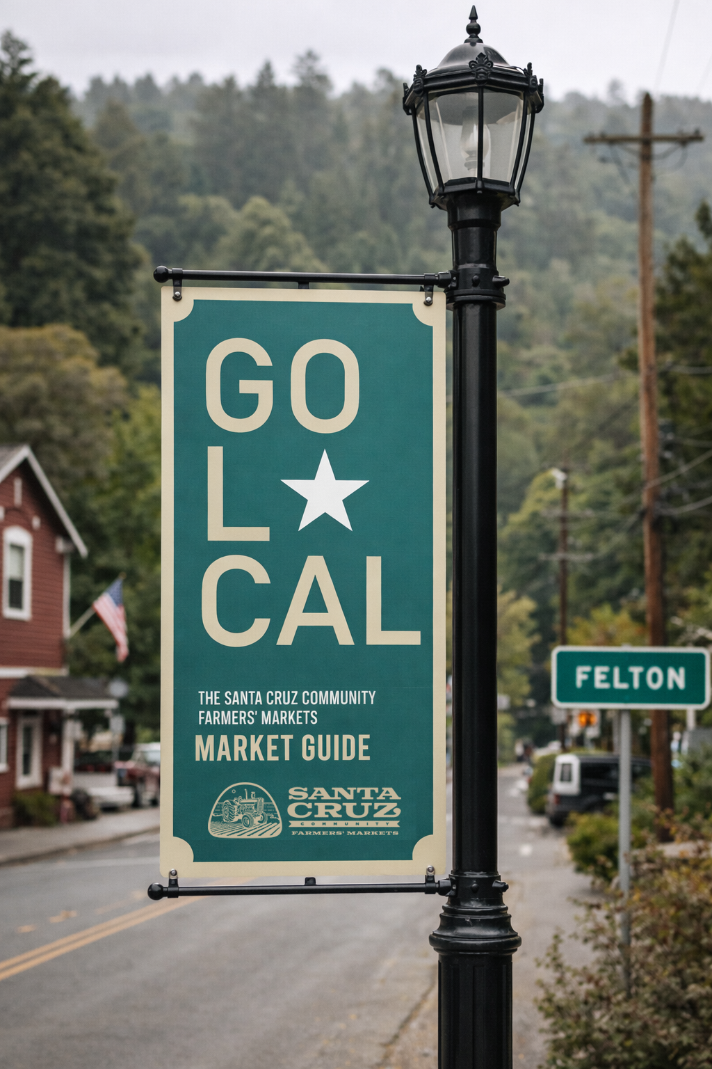
The Evolution
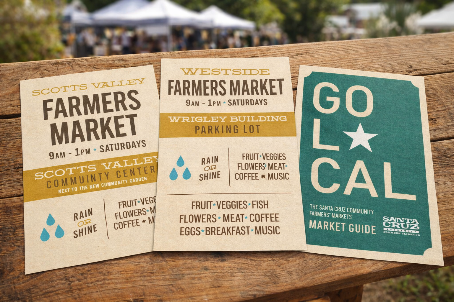
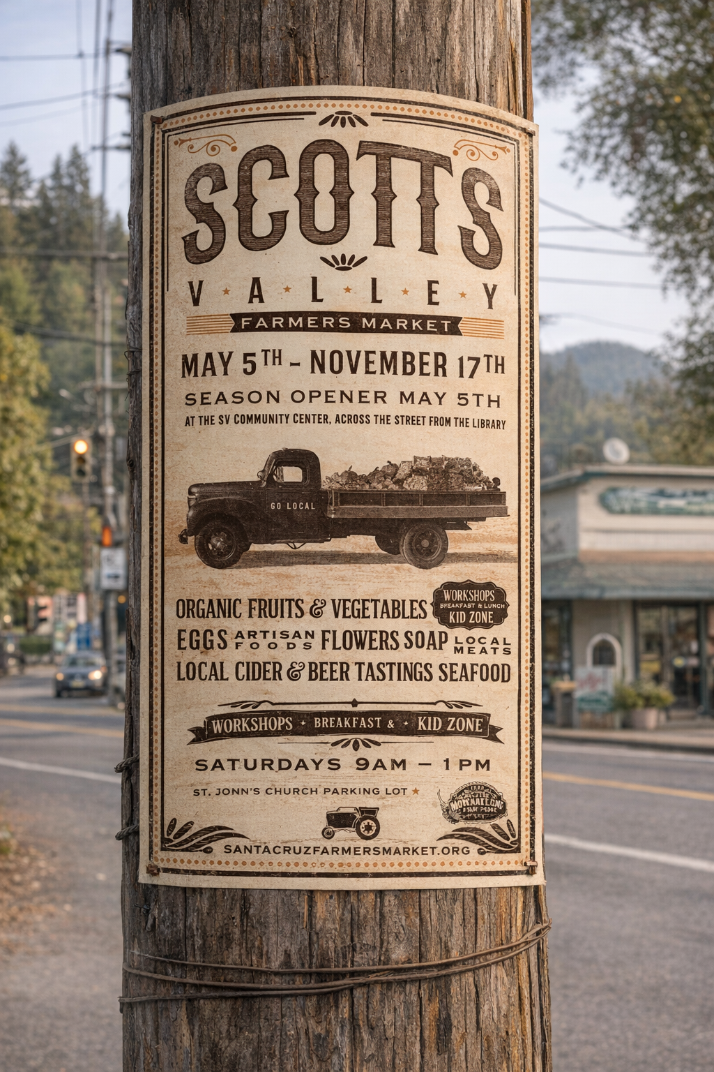
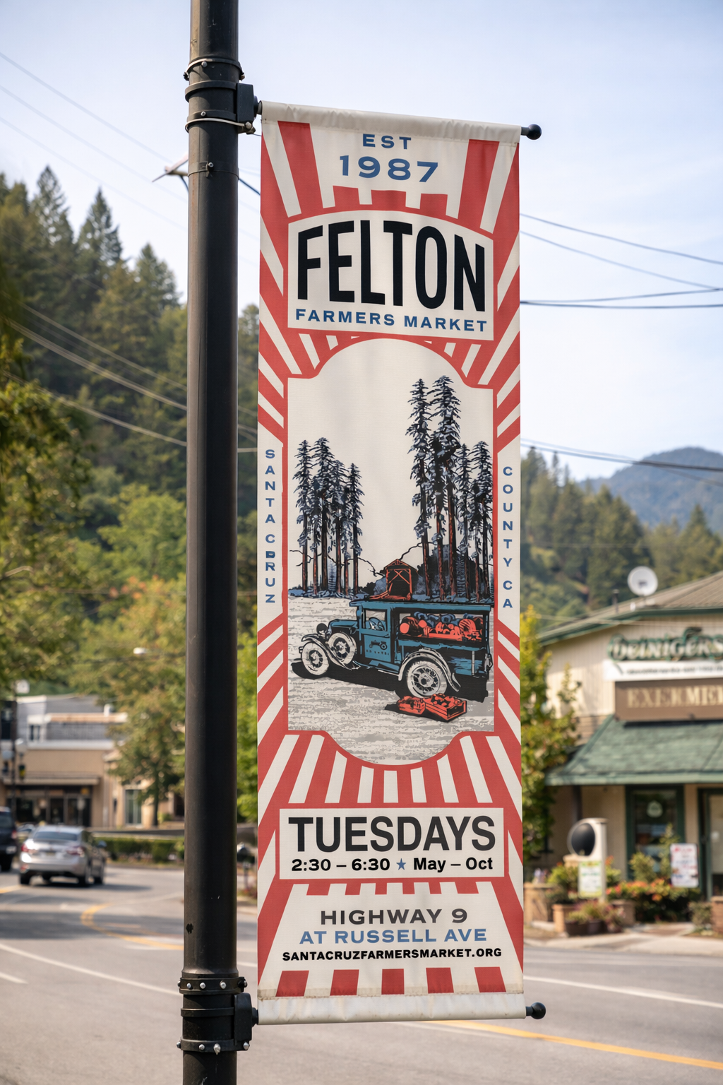
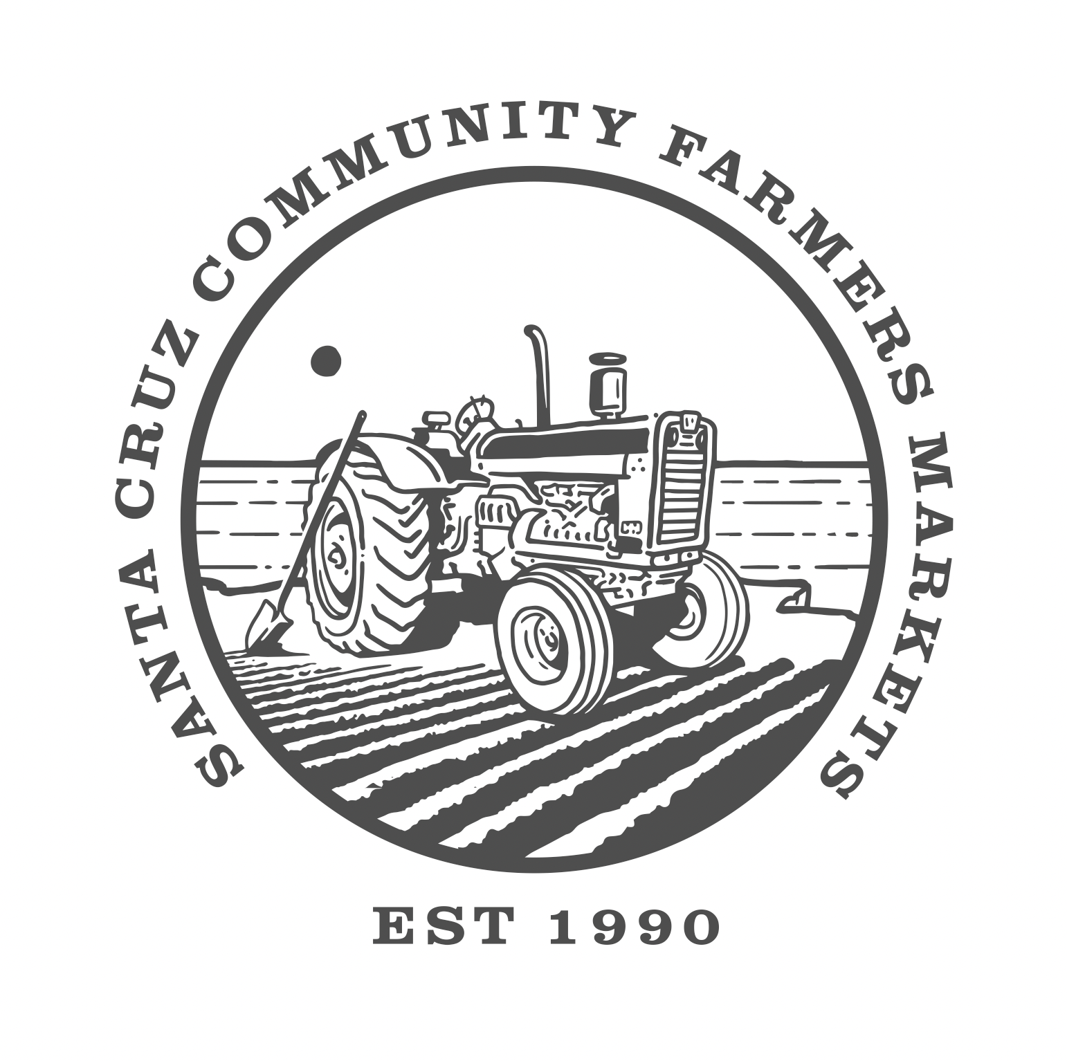
After developing seasonal posters and on-site signage, and visual themes rooted in Santa Cruz agricultural heritage: I formalized a cohesive identity system anchored by a refined tractor emblem, structured typography, and a disciplined color palette.
A New Brand Eco System
Once a new identity was put into place, I was able to formalize a more unified visual presence across the different markets in Santa Cruz. The various market signage and apparel have an updated, cohesive vibe throughout.